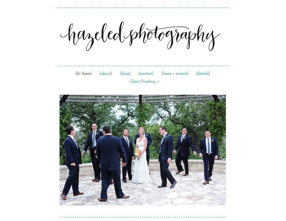
Hooray! I finally get to share Natalie’s rebrand! I have been (not so) patiently waiting to show you all how this came together. You might remember the sneak peek I posted a while ago and the moodboard I posted last week. Natalie came to me a few months ago wanting to totally rebrand her photography business, Hazeled. She felt it was time to really step her entire business up a notch and finally have a brand she felt represented her style and level of work. After talking with Natalie, I knew we were a match made in heaven. Not only is her work fantastic, (People! follow her on Instagram!) her enthusiasm and love for what she does is contagious. Not to mention she’s a fellow Southern belle. I had so much fun working with her, I am genuinely sad to not be talking with her once a week! It really is the BEST part of my job when my clients become friends. I am so lucky to have clients like Natalie! You can see her entire brand expression below.
We went for a modern, southern aesthetic using textures and vibrant colors paired with beautiful typography to complete the funky, yet sophisticated vibe. You can view her new site here.
And because everyone loves a before and after – here’s Natalie’s site and logo before….

And After!

So so so happy with all of this!! Thank you, Ann!! 🙂
I am happy you are happy! Thank you for all your patience, thoughts and great taste!
I love seeing slate, mustard, and coral used together. This looks great! I think the aesthetic really fit’s Natalie’s work. Thank you so much for sharing!
Thanks, Angel! I’m excited to share it.