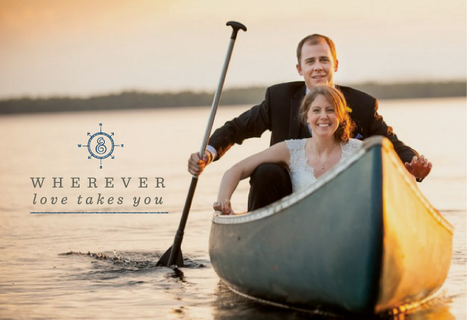
I am going to continue my (literal) blue streak with recent color palettes and share the new brand identity for Kate & Keith Photography! I am really loving navy right now, as can see. But today I want to focus on the creative duo that make up this super talented wedding photography team based in New England. Kate and Keith not only shoot weddings together, they travel together and well…are together. I loved working with these two and collaborating on not only their brand expression, but also totally renaming their business and helping them focus on their messaging. They are an adventurous team, sharing a love of yoga, traveling and the outdoors. Their previous identity design just wasn’t letting their personalities shine through. After getting to know them through our brainstorming discussions, the word “journey” became the inspiration for their overall branding.
The first thing we did was rename the wedding portion of their business. Previously, Kate and Keith were shooting weddings under the name Kate Harris Photography, but after working through the discovery process, it became clear that”marrying” their names to create one, strong business name was going to be very beneficial to attract their right clients. The combined name tells more of their story, too. And who doesn’t love the idea of a creative couple working with other couples to document the most special day of their lives? The hand-drawn ampersand was the perfect symbol for their union and those of their clients.
I had fun creating a tagline and brand positioning statement for Kate & Keith Photography, as well. Paired with the rustic, map-inspired design elements, the tagline “Wherever love takes you” was a perfect fit. It not only speaks to the fact that they do destination weddings, but also their own journeys bringing them together in this new (ad)venture.


comments +