
I’ve been a little off the grid lately, working on my site, celebrating the 4th and working on several exciting client projects. Oh, and the universe threw in some strep throat for good measure. It’s been a little crazy around here to say the least. Today I want to give you a bit more of a behind the scenes look into my creative process. Let’s talk about one of my favorite topics – color!
Throughout my design career, color has been one of the most subjective and powerful parts of getting a brand right. I’ve spent days dissecting a client’s feedback about the shade of blue he wants and even more time trying out different palettes. It can get a little overwhelming, even when you know what color story you are trying to tell. As I’ve begun to refine my creative process and client presentation, I’ve learned some great lessons along the way. So, I wanted to share my method in creating the perfect color palette for your brand.
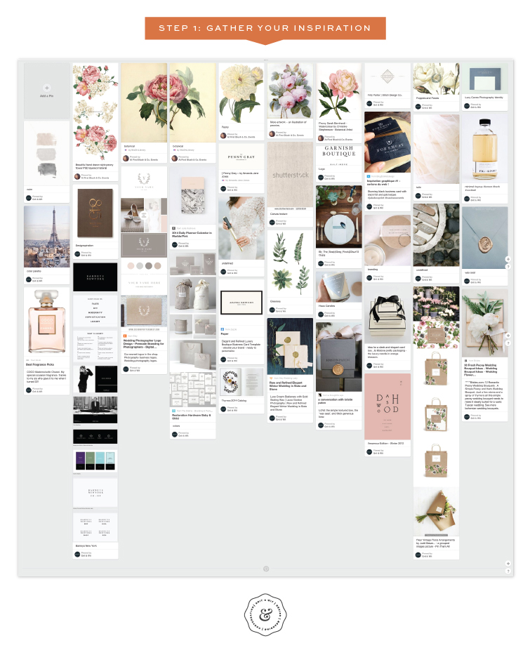
Step 1: Gather Your Inspiration
It goes without saying that curating, gathering, pinning and selecting before you start on the actual design elements is the first step in creating a strong brand story. In design school, we weren’t even allowed to turn on the computer without putting together a mood board and doing plenty of sketches first. Although I’ve gotten more efficient since then, I always start with the basics first. Today, I gather inspiration in secret Pinterest boards and then filter from there into PDF presentation for my client. I don’t focus solely on what I can find on Pinterest because that can get a little stale. I like to visit plenty of other sources to keep things fresh and unique. At first I tend to dump a ton of images onto the board. I grab things without overthinking and make quick decisions on imagery. If it strikes me as something that could work, I grab it. I don’t worry too much about colors just yet but instead look for design treatments, photography, pattern and anything with a similar visual feeling. Then, I try to focus. What is the feeling the brand needs to convey? If the image doesn’t fit, I delete it. It’s all about quality over quantity. I also like to use images of my client’s work or product to make sure I am creating something true to their style. At this point, I start to look at the overall board. The images should be similar in style and starting to feel cohesive. There should be a color story emerging naturally.
Here, I’ll show you an example from a current project I am working on.
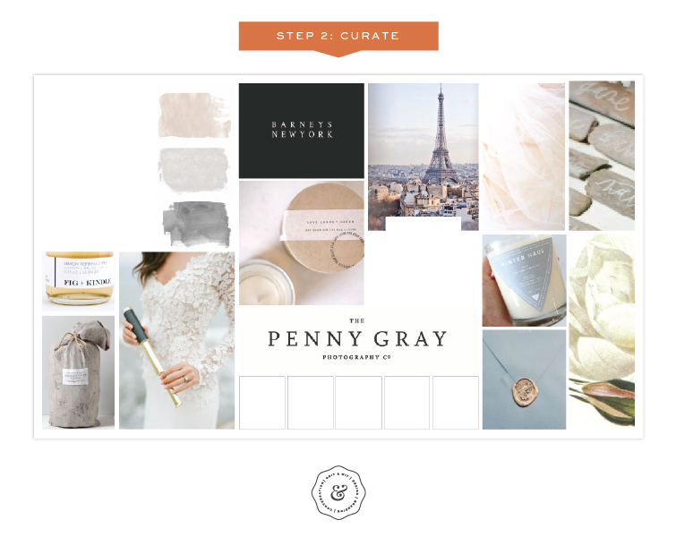
Step 2: Curate
I like to get very specific with my mood boards. I cherry pick the best and most powerful images from the larger Pinterest board I’ve created and put them into a “collage” PDF. This way I can alter colors or crop out parts of images that even slightly take away from the overall look and feel. It’s all about filtering down, focusing and creating a board that almost becomes one cohesive image.
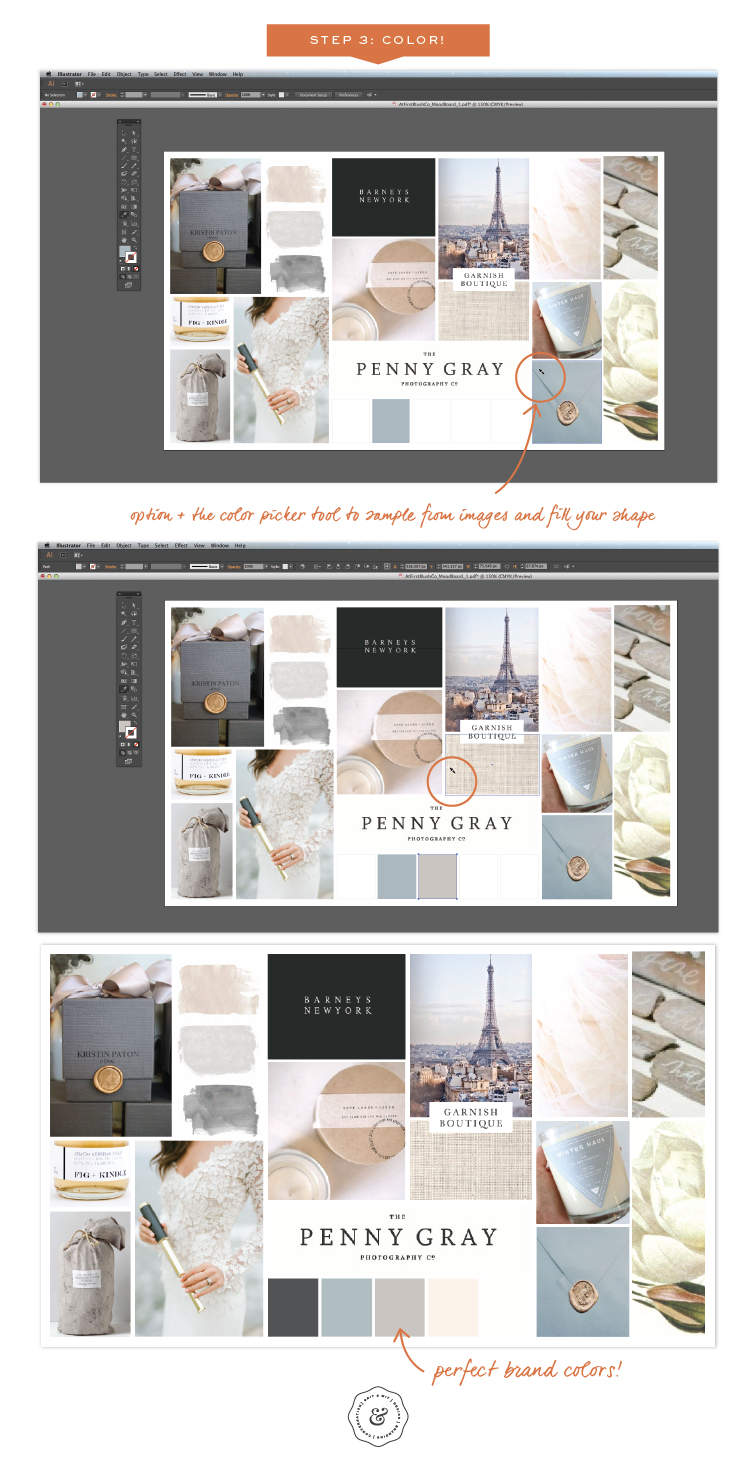
Step 3. Color! Creating the Palette
I know…you are wondering where the color palette comes in? After I’ve presented my mood board to the client and gotten a resounding YES! response, I move forward with the brand design. But wait! I don’t just forget about the board. I keep it in my working design files for reference and direction throughout the rest of the process.
Here’s where my perfect palette tip comes in.
Once you have the right brand inspiration established in the mood board, open that document in Illustrator or Photoshop. Draw 5-8 shapes without a color fill. Select one shape.
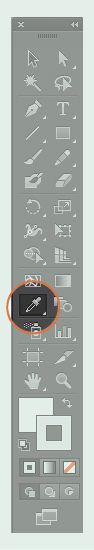
With the color picker tool, hold down option (on a Mac) and click with the eyedropper to sample a range of images on your board. You’ll see your selected box fill with the color of the pixel being sampled. This is a great way to create a cohesive, in-brand color palette. This practice also helps me branch out of my typical color palette inclinations and think about more unexpected pairings.
There you go! I hope this helps you on your next design project or on your own brand design. If you like info like this, I plan on posting more insider tips in the weeks to come. If you like more personal posts about running a creative business and creating brands, head to the bottom of this page and sign up for my newsletter. I promise not to bombard you with emails!
Happy coloring!
This is a great tool, thanks much! Your work is inspired. I hope to have you do a ‘re-brand’ for me soon.
Thanks, Stephanie! I am glad you liked it! Feel free to reach out when you are ready to rebrand.